Form Editor - Button Help
The Button control provides a command button.
The command button is perhaps the most commonly used control in any graphical user interface. Push (click) a button to command the computer to perform some action, or to answer a question. Typical buttons are OK, Apply, Cancel, Close, Yes, No and Help.
A command button is rectangular and typically displays a text label describing its action.
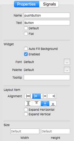
Properties
- Name – The name of the control.
- Text – The text on the button.
- Default – Defines whether the push button is the default button. Default buttons decide what happens when the user presses enter in a dialog.
- Flat – Defines whether the button border is raised. If this property is set, most styles will not paint the button background unless the button is being pressed.
Widget
- Auto Fill Background – This property holds whether the control background is filled automatically.
- Enabled – Defines whether the control is enabled or not.
- Font – This property holds the font currently set for the control. The default depends on the system environment.
- Palette – This property describes the control's palette.
The palette is used by the control's style when rendering. The color roles from this palette are combined with the control's default palette to form the control's final palette. The default depends on the system environment and may be different on different platforms. Control propagates explicit palette roles from parent to child. If you assign a brush or color to a specific role on a palette, that role will propagate to all the control's children, overriding any system defaults for that role.
- Tooltip – The tooltip text.
Layout Item
- Alignment – Defines both the horizontal and vertical alignment.
- Expand Horizontal – If ON the control is expanded horizontally.
- Expand Vertical – If ON the control is expanded vertically.
Size
- Width – The width of the control.
- Height – The height of the control (Disabled).
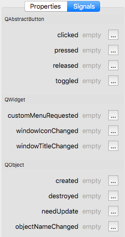
Signals
QAbstractButton
- clicked( checked ) – This signal is emitted when the button is activated (i.e., pressed down then released while the mouse cursor is inside the button), when the shortcut key is typed, or when click() or animateClick() is called. If the button is checkable, checked is true if the button is checked, or false if the button is unchecked.
- pressed – This signal is emitted when the button is pressed down.
- released – This signal is emitted when the button is released.
- toggled( checked ) – This signal is emitted whenever a checkable button changes its state. This may be the result of a user action, click() or because the checked property is set. The checked argument is true if the button is checked, or false if the button is unchecked.
QWidget
- customMenuRequested – This signal is emitted when the user has requested a context menu on the control.
- windowIconChanged – This signal is emitted when the window's icon has changed.
- windowTitleChanged( title ) – This signal is emitted when the window's title has changed, with the new title as an argument.
QObject
- created – This signal is emitted after the object is created.
- destroyed – This signal is emitted immediately before the object is destroyed, and can not be blocked. All the objects's children are destroyed immediately after this signal is emitted.
- needUpdate – This signal is emitted when the control needs to be updated, for example, on the change of the current record.
- objectNameChanged( objectName ) – This signal is emitted after the object's name has been changed, with the new object name passed as an argument.


